A new face for energy, with an eye to the future.
© 2026 Cherries SRL. All Rights Reserved | P.IVA. IT03405870126
A new face for energy, with an eye to the future.

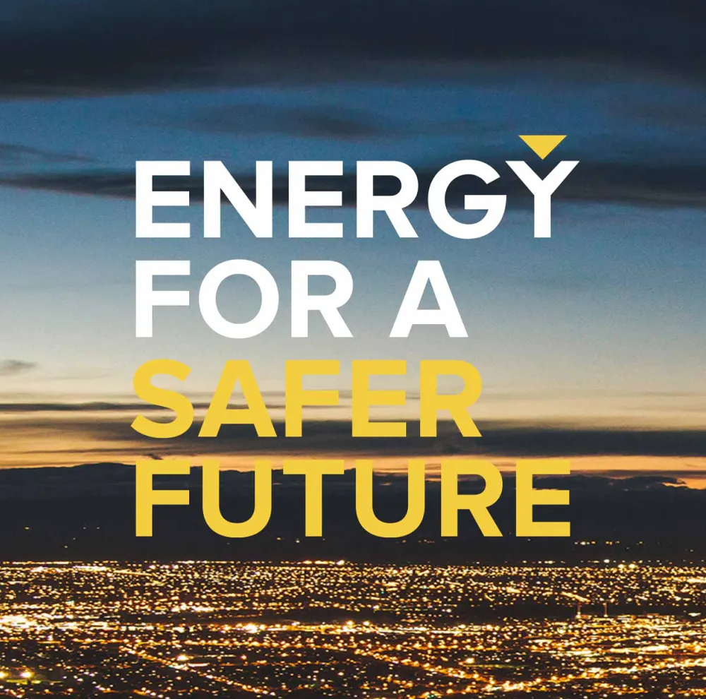
A commitment to a safer future
Thytronic is an independent Italian company that manufactures electrical power protection systems and has been in business for over 50 years. Shortly before the world hit rock bottom, Thytronic approached us for rebranding and related activities, and what was supposed to be a standard repositioning project instead became an in-depth exploration of the future, the need for safety and everyone’s responsibility for a different tomorrow. From these reflections emerged a corporate manifesto based on strong values such as energy, the future and safety, which was brought to life on a completely new, engaging and contemporary website, capable of speaking to both businesses and individuals.
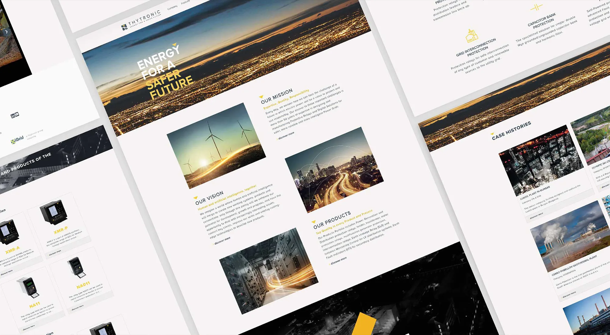
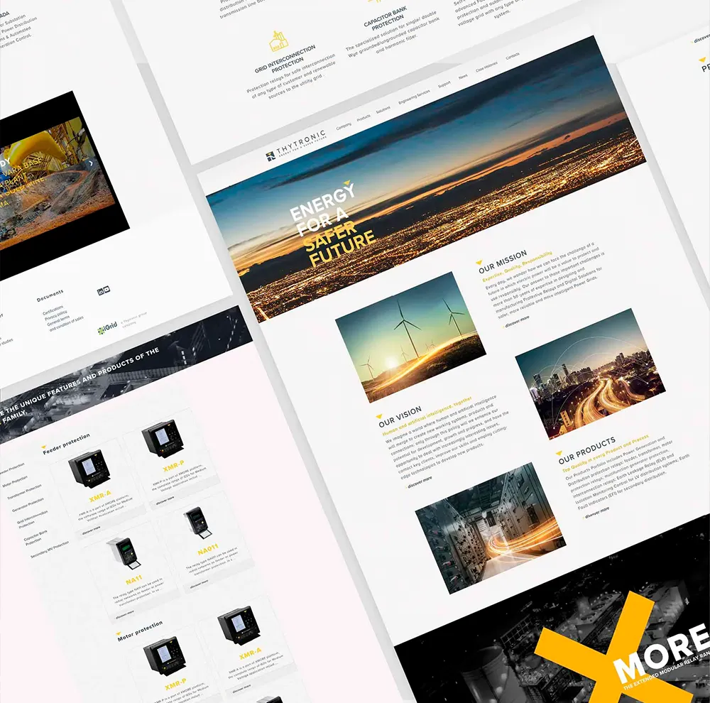
The evolution of an identity
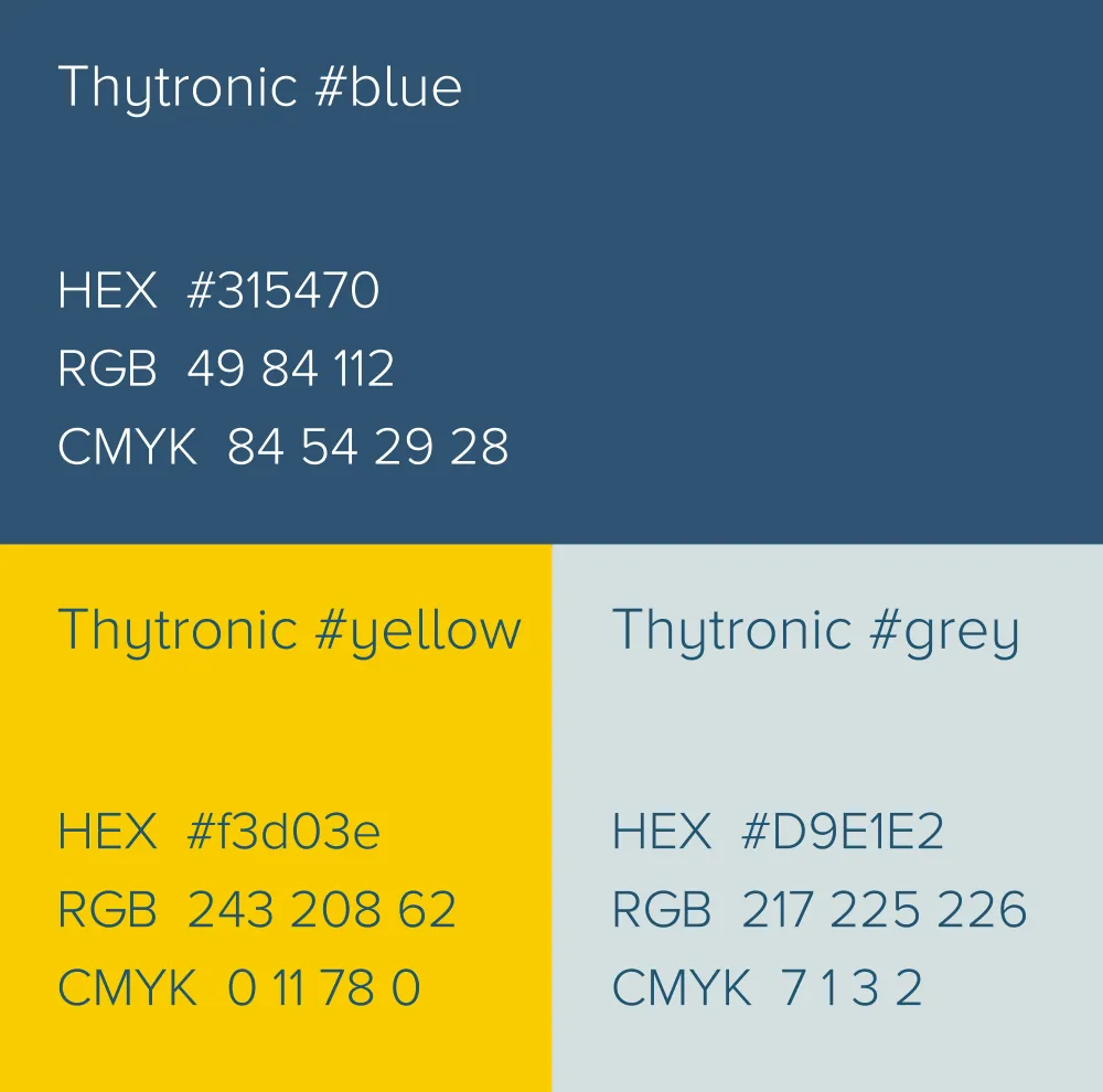
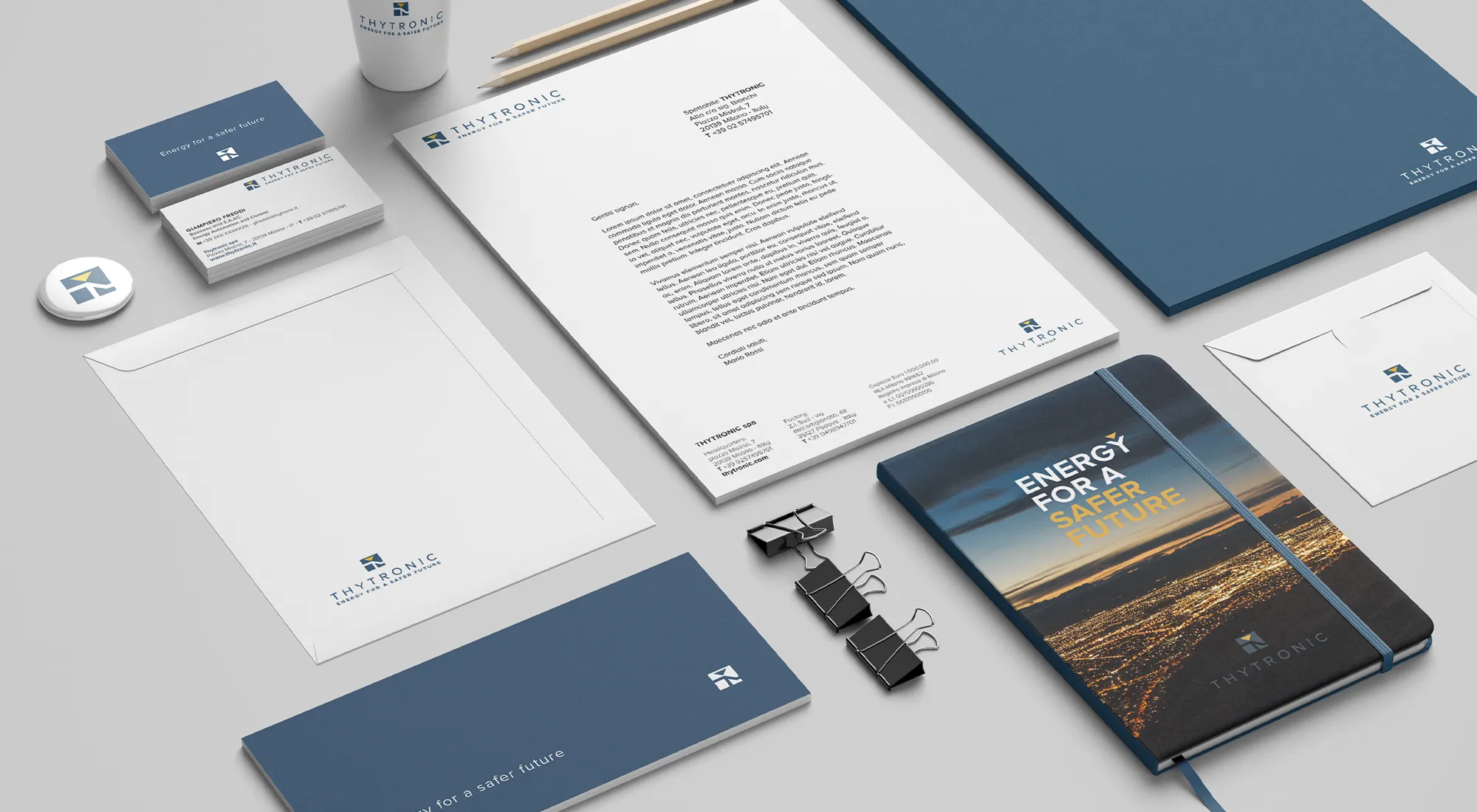
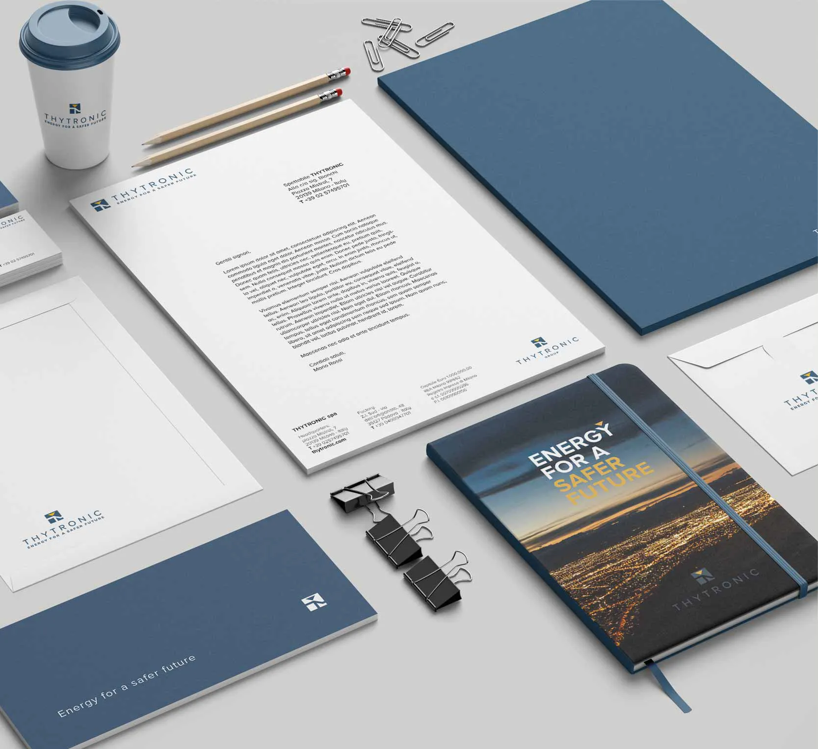
Contrasting colours to emphasise the energetic drive towards the future: a reassuring blue, befitting a leader, grounded in its history, and a yellow that glows from the background to symbolise energy, light and tomorrow. A simple, modern and functional typeface, easy to read at all sizes and well-suited to conveying the brand’s values. Clear, simple and important values: this is the evolution of Thytronic.
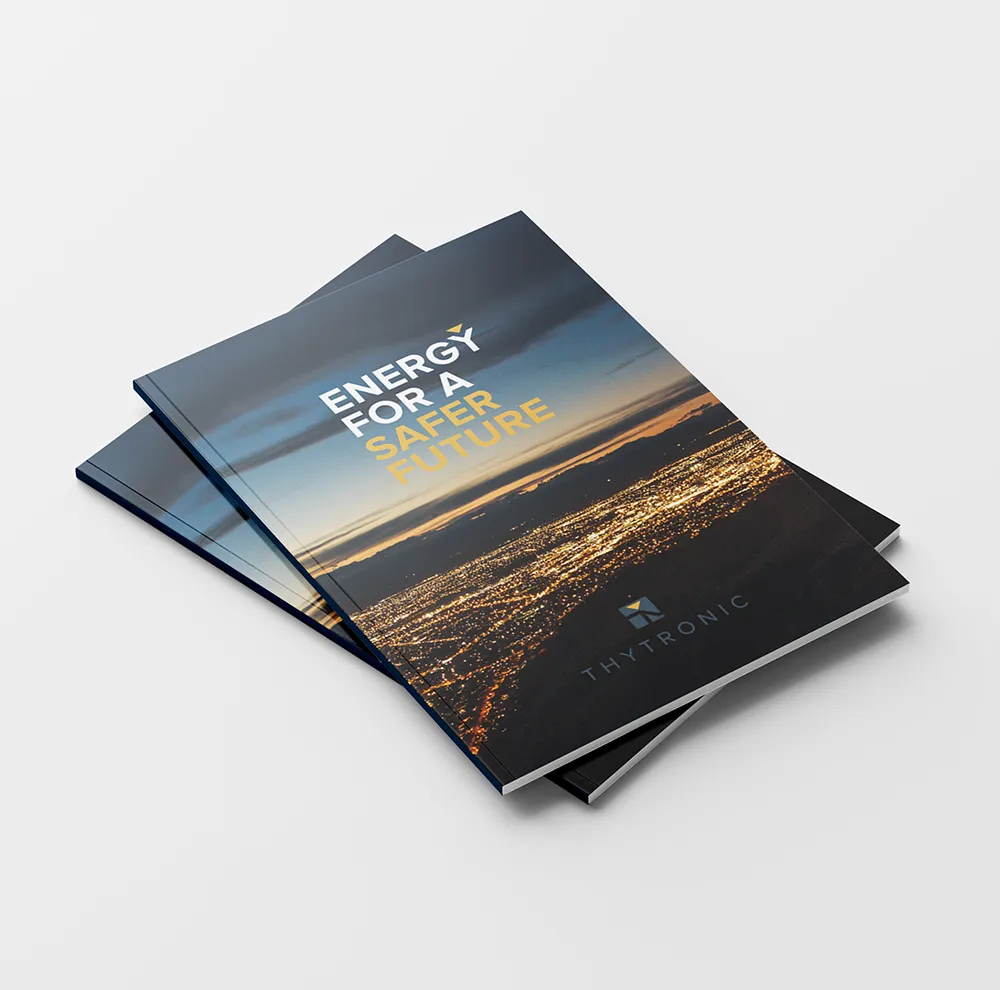
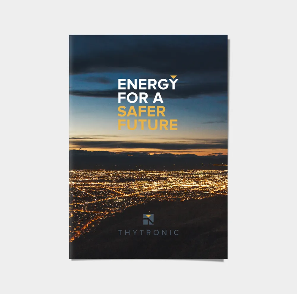
The brand manual as a communication tool
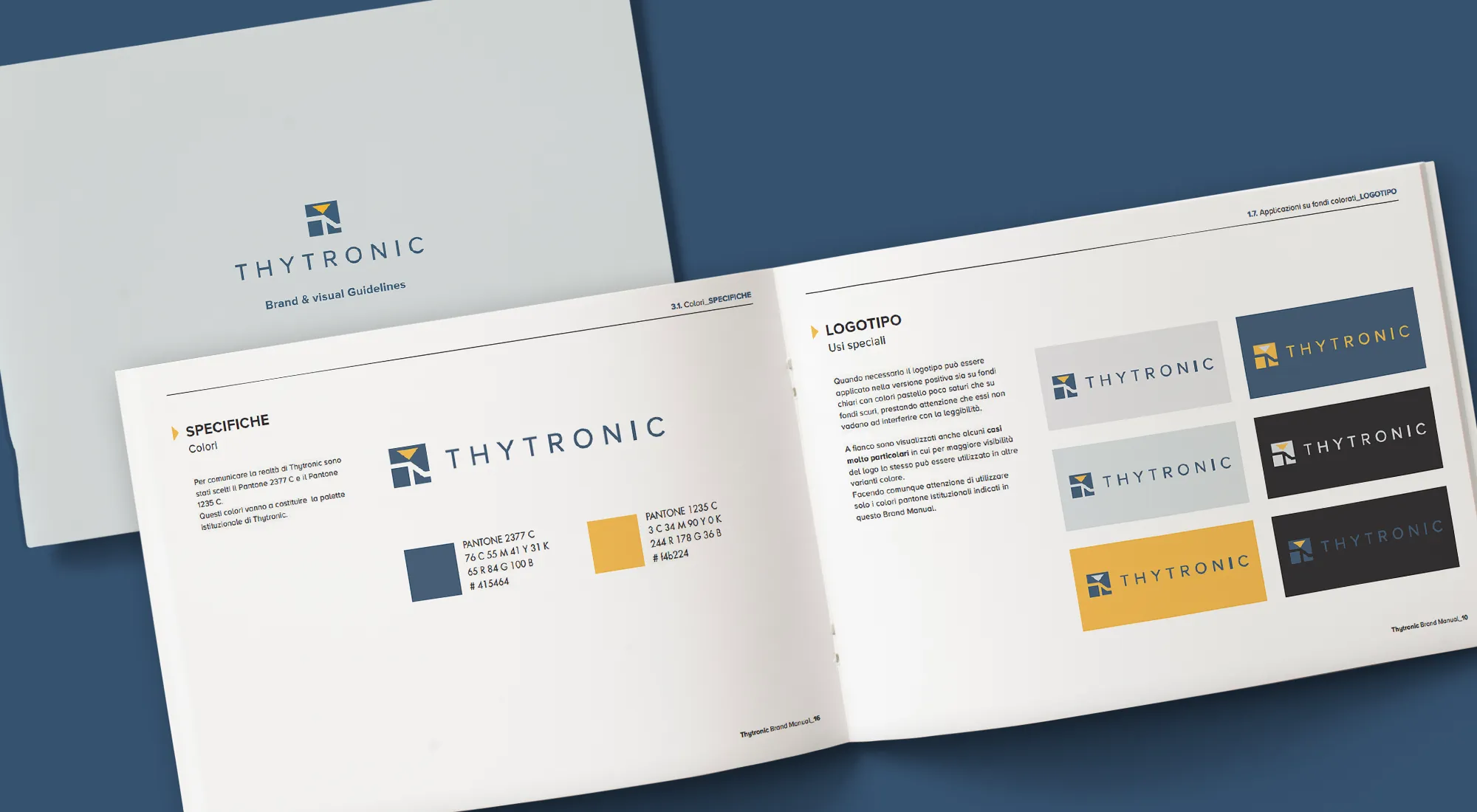
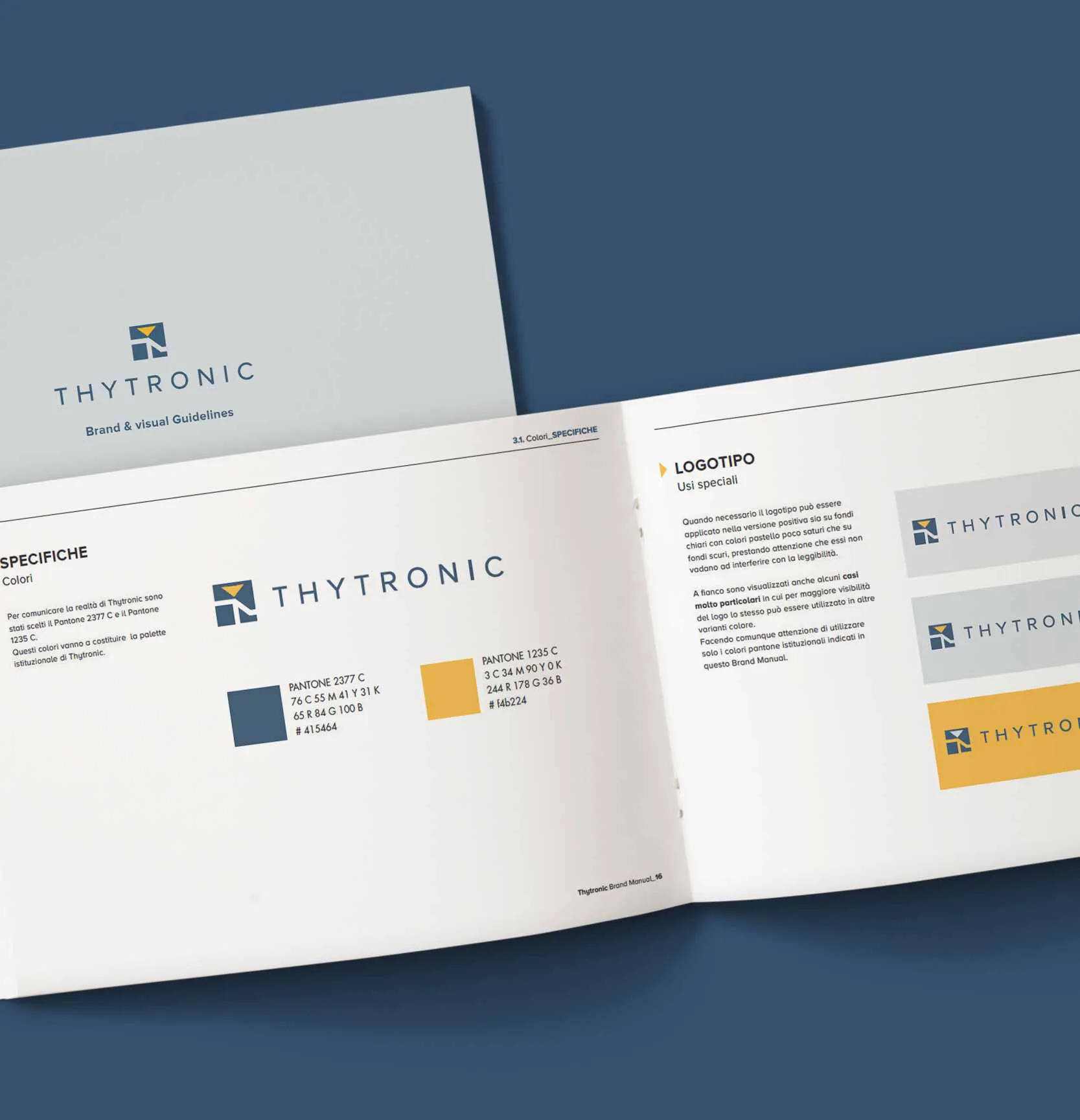
Transforming the brand manual from a tool for industry professionals into a marketing tool to convey transparency, accountability and commitment: with a single click from the website, you can access a dedicated microsite where you can explore the core elements of Thytronic’s new identity, the result of a history of excellence and hard work that began more than 50 years ago.