© 2025 Cherries SRL. All Rights Reserved | P.IVA. IT03405870126
Arexons 100 Years: a logo to illuminate a century of innovation and passion.
Client
Arexons
Sectors
Manufacturing
Services
Brand Guidelines
Brand Positioning
Workspace Design
A century of achievements at full speed
There are those who wait for the future. And those who, like Arexons, have been tackling it at full speed, with grit and determination, for a hundred years. A historic Italian brand and a reference point for products for the care and maintenance of cars, motorbikes, boats, industry and the home, Arexons has turned one hundred years old and has chosen Cherries to tell the story of a century of success between innovation and passion in a logo.
And so, to celebrate this extraordinary milestone, we came up with the claim 'For 100 years we have been making your passion shine', the guide for all Arexons' communication activities in 2025.
Red, white, black and gold: the colour palette of the samples
We worked on the colour palette of the logo, keeping the symbolic colours of the brand, red, white and black and introducing the colour gold: a sign of victory, excellence and achievements.
The logo celebrating the history of an evolving brand
For the celebratory logo, the number '100' is lit up with meaning: the zeros turn into circuits, evoking the roads travelled and those yet to be explored.
A simple and impactful visual to tell the story of Arexons, a brand in continuous evolution, which has never stopped being passionate and shining.
Discover our projects
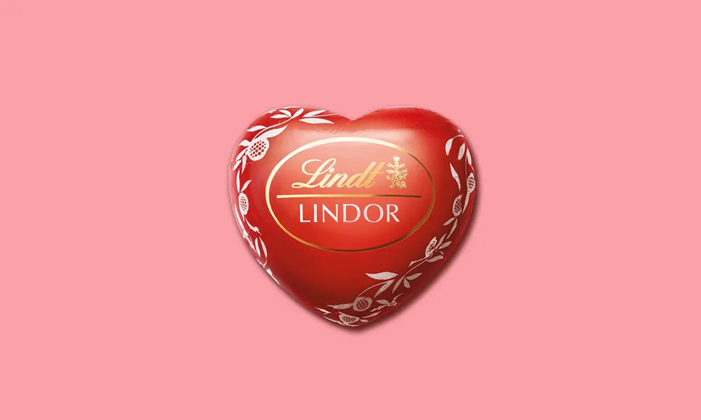
Lindt
Lindor & Gio Evan: when chocolate meets love, poetry is born.
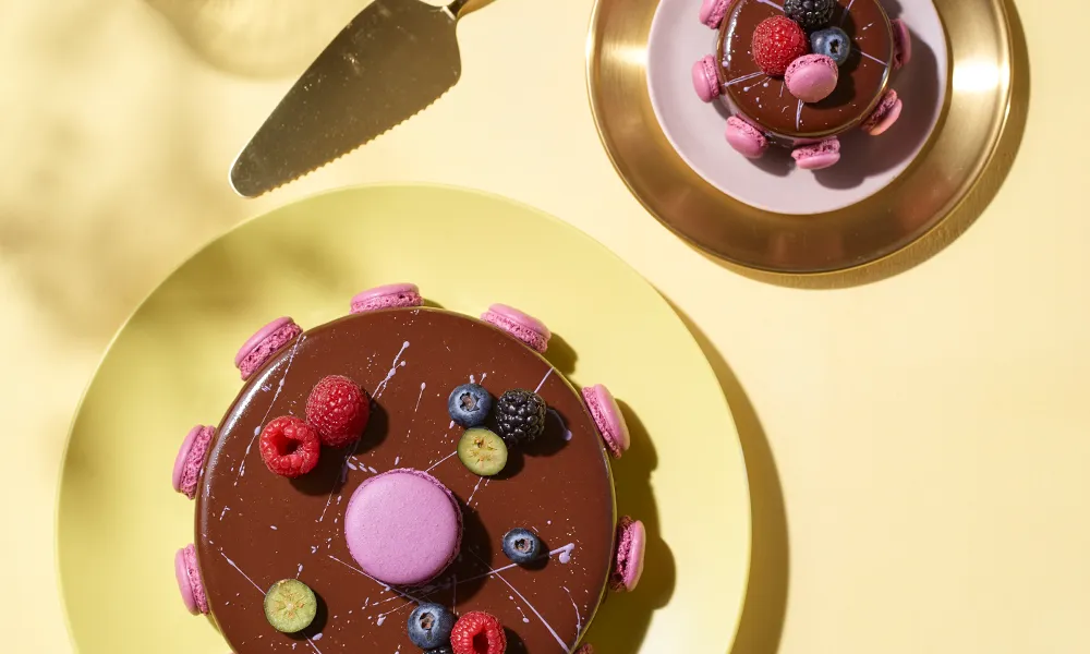
C'est la vie
Sweetness, to be experienced and shared: C'est La Vie confectionery on Social.
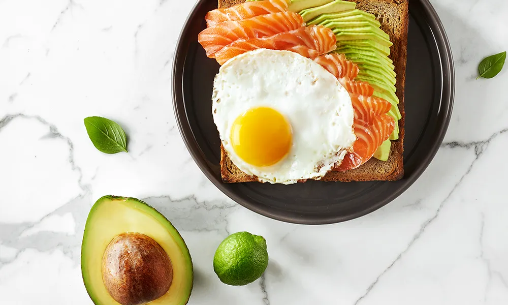
E-cooking feel good
A chef's dream come true.
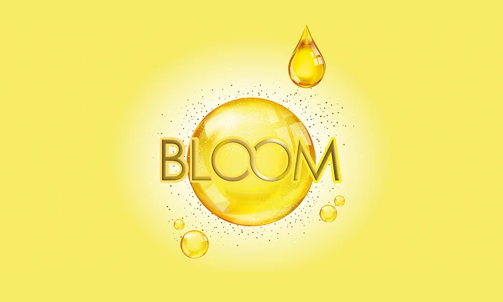
Dikson
Bloom: vivid colour, unexpected result. A new vision of beauty.
Arcigay
The kind of stories we like to tell. Because inclusion is an action.
Exergy
The energy of a pioneering brand, told with a fresh look.
La posteria
A story of taste and passion, told every day on social media.
Let's talk
Do you have a project that aims to surprise, or simply want to learn more about how we work? Let’s get in touch soon.
© 2025 Cherries SRL. All Rights Reserved | P.IVA. IT03405870126
© 2025 Cherries SRL. All Rights Reserved